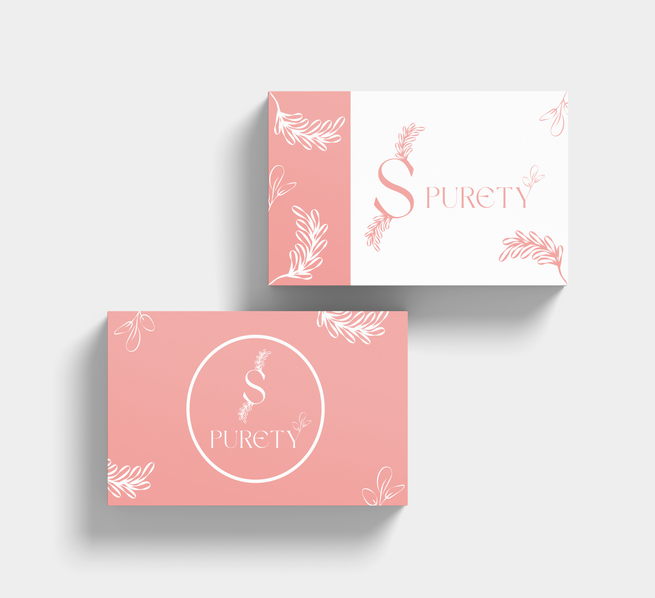
Let me walk you through the SPURETY project. We started with the logo design, which is elegant and nature-inspired. It features the name "SPURETY" with a stylized 'S' adorned with a leaf motif, conveying a sense of purity and connection to natural ingredients.
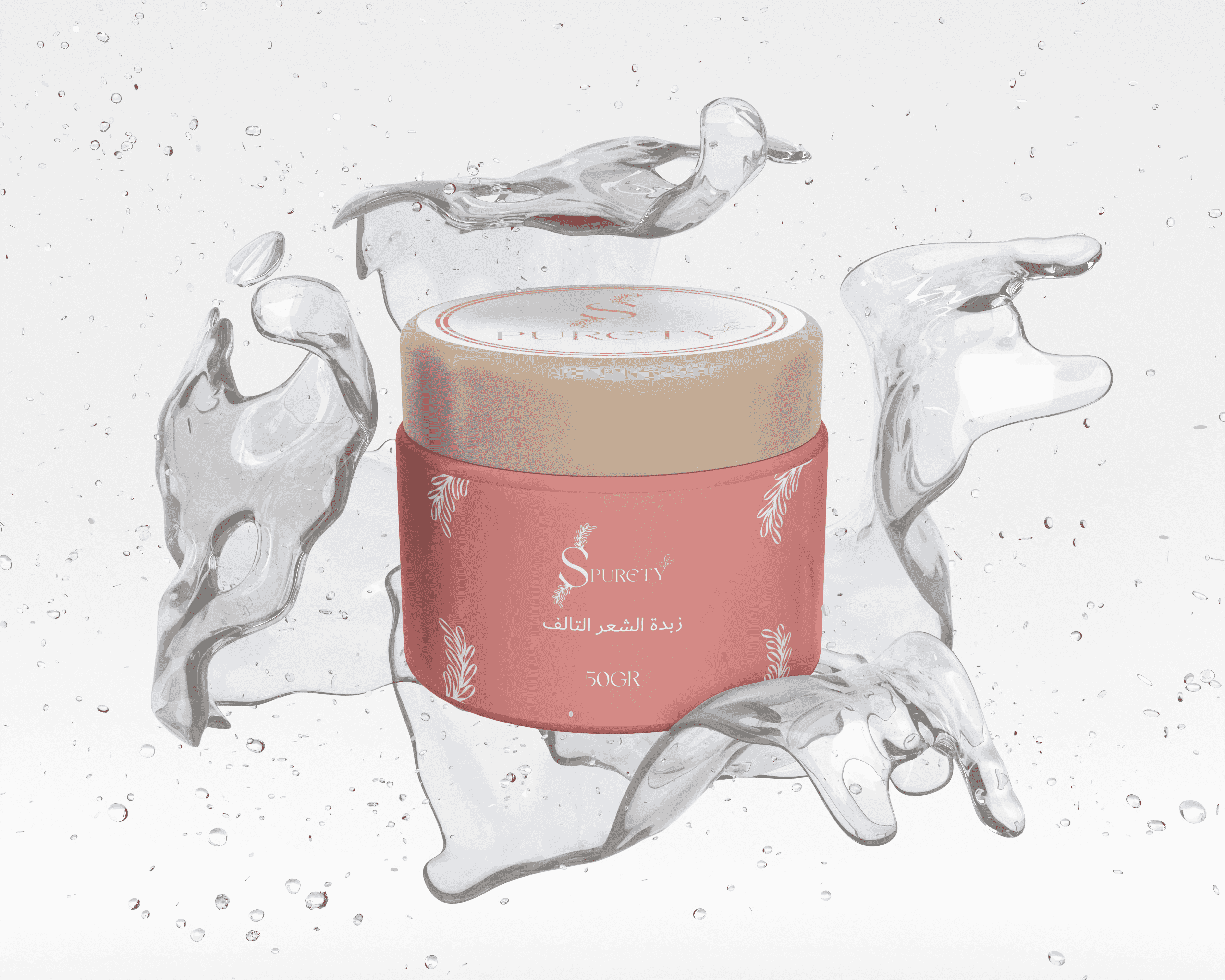
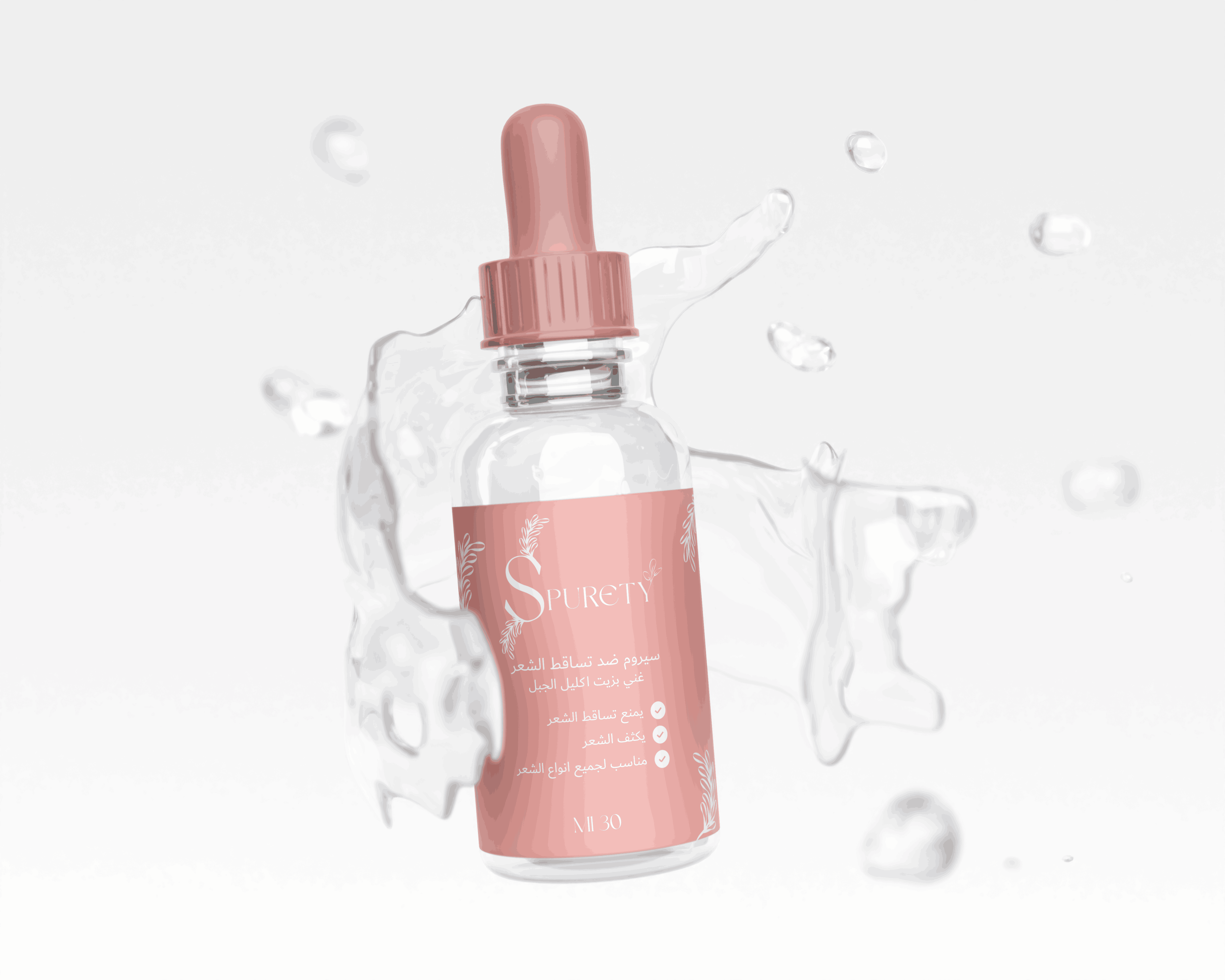
Moving on to the packaging, we crafted a clean and sophisticated design. The focus was on using soft, calming colors like light pink and white, complemented by premium materials. This design clearly positions the product in the high-quality, natural beauty market.
For the color palette, we chose soft pink and white. These colors work together to create a sense of tranquility, purity, and elegance, which aligns perfectly with the brand's values.
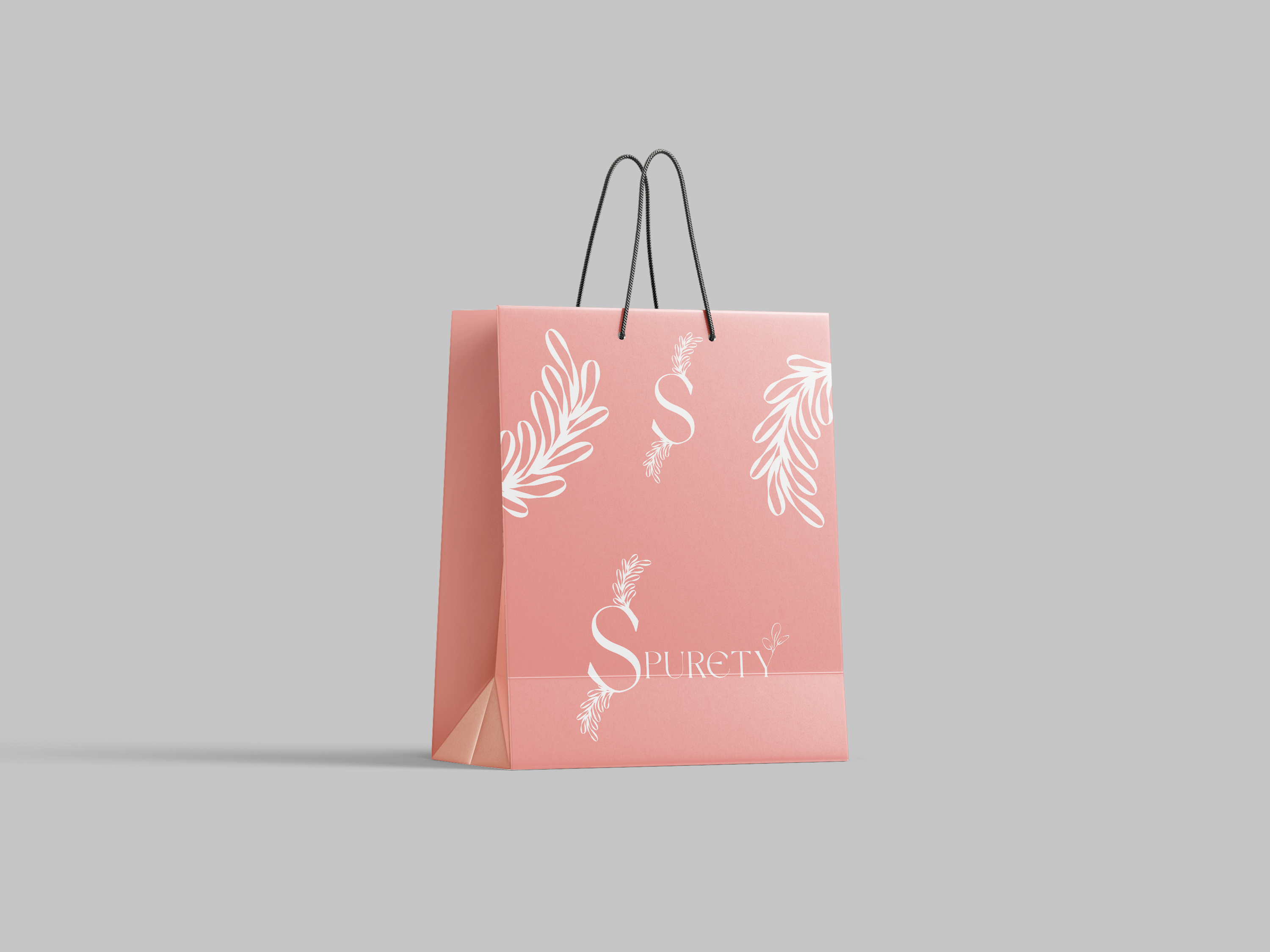
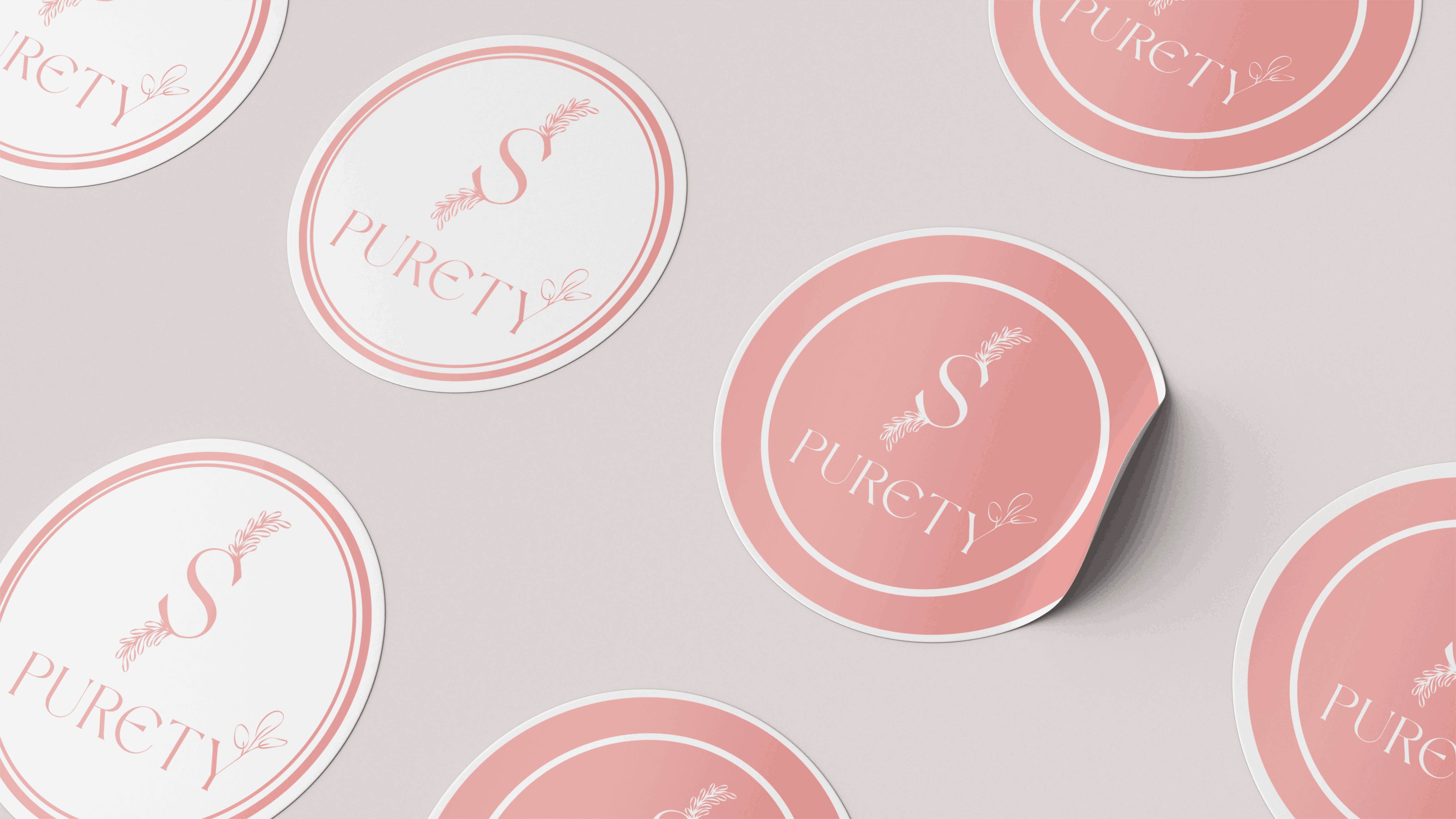
Lastly, we paid special attention to the marketing materials. We included branded shopping bags, packaging boxes, and promotional materials featuring the repeated logo pattern to enhance the customer experience and ensure that the brand presentation is cohesive and memorable. The overall design reflects a commitment to quality and natural beauty, ensuring that customers feel they are choosing a product that is both luxurious and in harmony with nature